What is a WYSIWYG in WordPress?
You might have come across this weird word WYSIWYG while using WordPress. What does it mean? And how should you use them correctly?

WYSIWYG in WordPress is an editor that shows you in real-time exactly what your content will look like after you publish. They are awesome, but can also be damaging to a WordPress website. We will get to this later…
WYSIWYG stands for: ‘What you see is what you get’
As you know, websites and apps are developed using different types of code. If you want to publish content on the web with no coding experience you can use content management systems (CMS).
There are lots of CMSs that have their variation of a WYSIWYG, whether it is made by the CMS platforms themselves or a third-party plugin.
WordPress comes straight out of the box with a slightly modified TinyMCE WYSIWYG. Alternatively, you can install something else.
Before you use a WYSIWYG, you would use a page builder to click and drag the type of content you want onto your page. When you’ve done that, you are ready to add and edit content. This is where your WYSIWYG would come into play.
Right now, as you read, I am entering content into a WYSIWYG in WordPress – talk about 4th Dimension!
So, instead of having to write HTML like this (plus a lot more programming knowledge, but using this as a basic example):
<div>
<h1>This is a H1 heading</h1>
<h2>H2 headings look like this</h2>
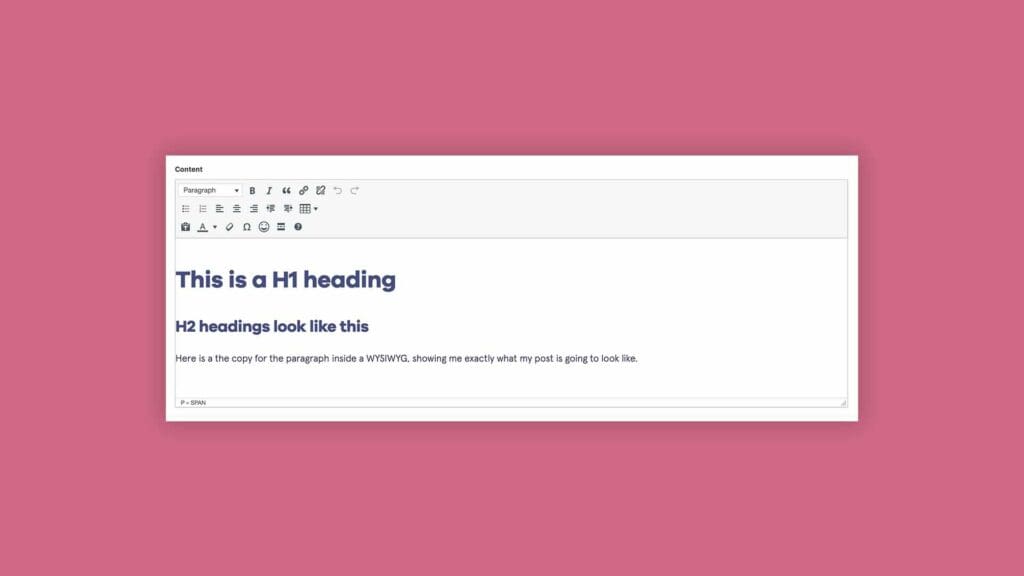
<p>Here is the copy for the paragraph inside a WYSIWYG, showing me exactly what my post is going to look like.</p>
</div>
All I need to do is log into WordPress, and enter content in a WYSIWYG like this:

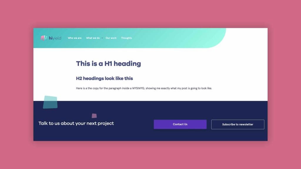
And then when I publish the page, I end up with a live web page like this:

The live version and the WYSIWYG in WordPress are exactly the same. It’s just like using Microsoft Word or Pages where you see what the page will look like if you were to print it – these actually fall under the same category as a WYSIWYG.
By now you should have a full understanding of what a WYSIWYG is. You probably have used one without even realising it was in fact a WYSIWYG.
Either way, you know now! And you can see how awesome they are.
But sometimes a WYSIWYG can harm your website. Let me explain…
Too much functionality on a WYSIWYG in WordPress is harmful
For us as an agency, we design and build bespoke WordPress websites for enterprises and established businesses.
We go through a rigorous UX & UI design process for a website. It is essential to the success and return on investment (ROI) of the site, but works in harmony with a business’s goals and its users.
So having a WYSIWYG with too many options and features can end up harming the UX & UI of the entire site.
Here’s a simple example:
If there is an option to align content centrally, however in the UI Design it is meant to be left-aligned, this can hugely harm the experience. This is because if the goal of the site is to convince a user to convert (get in touch), the site must be able to flow effortlessly without any jarring designs.
In this situation, what we like to do is modify a WYSIWYG so that a content editor has only the core functionality, along with their branding.
But of course, if you don’t have access to or enough funds to hire a WordPress web developer this isn’t an option. So my advice to you is to make sure that you stick to your theme branding and proposed user experience if you have one.
Or, if you’re looking for a bespoke WordPress website to level up your business, book a no-obligation call with our team to explore your options.

Let’s get started!
Great digital products aren’t just built, they’re co-created. Together, let’s breathe life into your idea, crafting solutions that stand out.
Contact

