Responsive Web Design London
In the bustling digital landscape of London, responsive web design is not just a trend; it’s a necessity. As a leading provider of responsive web design services in London, we understand the importance of creating websites that not only look great but also perform flawlessly across all devices. Our mission is to craft digital experiences that are as flexible and dynamic as the city itself.


Responsive Web Design London
What is Responsive Web Design?
Responsive web design is the approach that ensures web pages perform well on various devices and window or screen sizes. It’s pivotal in creating flexible, user-friendly websites that offer an optimal viewing and interaction experience—easy reading and navigation with a minimum of resizing, panning, and scrolling—across a wide range of devices.
You’ll get some huge benefits
- Enhanced User Experience: Responsive web design ensures a seamless viewing experience on all devices, improving user satisfaction.
- SEO Advantages: It boosts your site’s search engine rankings by meeting mobile-friendly criteria set by search engines.
- Cost Efficiency: Eliminates the need for multiple versions of your site, reducing development and maintenance costs.
- Higher Conversion Rates: Improves user engagement and accessibility, leading to increased conversions and customer interactions.
- Future-Proof Design: Adapts to new and emerging devices, ensuring your website remains functional and relevant in the long term.
Why Responsive Design Is Crucial for London-Based Businesses
In a city as dynamic as London, businesses must have a digital presence that’s just as agile and adaptive. A responsive website is crucial to cater to London’s diverse, tech-savvy population and the city’s ever-evolving technological trends.
Our Process
Crafting Tailored Responsive Websites
1. Initial Consultation and Strategy: We start with a thorough understanding of your business goals and target audience, laying the foundation for a strategy that aligns with your objectives.
2. Design and Development: Our team of skilled designers and developers then brings the strategy to life, creating a site that is not only aesthetically pleasing but also technically sound and responsive across all devices.
3. Testing and Optimisation: We rigorously test the website on various devices and browsers, ensuring flawless performance and ironing out any issues for a smooth launch.
4. Launch and Continuous Support: Once live, we continue to offer support and make necessary adjustments to keep up with evolving technology and user needs.


Our Expertise: Tailoring Digital Experiences
Case Studies
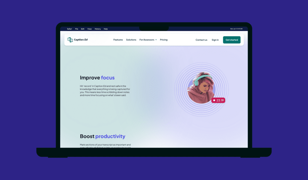
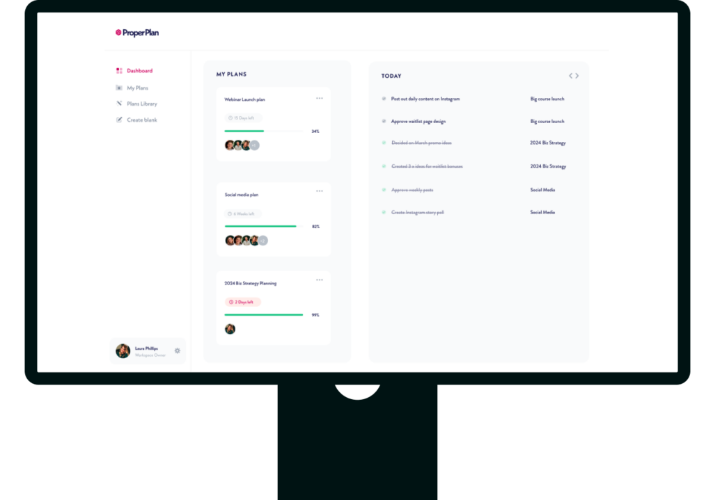
Explore our portfolio of successful responsive web designs. We highlight how our bespoke solutions have empowered London-based businesses, reflecting our understanding of the local market’s unique demands.
Client Feedback
Read testimonials from our satisfied clients. Their experiences underscore our dedication to excellence and the impact of our responsive design solutions on their digital success.
Connect with us to revolutionise your online presence
Whether you’re a startup or an established brand in London, we’re equipped to enhance your digital footprint. Our responsive web design solutions are crafted not just for the global digital arena but with a deep understanding of London’s unique business landscape.
At Hiyield, we’re more than just web designers; we’re digital architects who understand the pulse of London. We’re committed to building web experiences that resonate with your audience and drive your business forward. Let’s build a future-ready digital presence that stands out in London and beyond.
Explore our work


Let’s get started!
Great digital products aren’t just built, they’re co-created. Together, let’s breathe life into your idea, crafting solutions that stand out.