
7 tips to create a high converting landing page
Are you bored of a low conversion rate? Here 7 tips that will help you create a high converting landing page. Start optimising today!

Stay in the loop with our latest updates
Are you bored of a low conversion rate? Here are 7 tips that will help you create a high converting landing page. Start optimising today!
The first page a user lands on has the power to not only capture a visitor’s attention but also determine whether or not they will take the next step and become a customer. And, it has the opportunity to shape their overall experience with your brand. That’s why it’s so important to create a bespoke web design that reflects your brand, as well as using these 7 tips to create a high converting landing page.
We all know that the first page a visitor sees is the most important
The first page a user lands on has the power to not only capture a visitor’s attention but also determine whether or not they will take the next step and become a customer. And, it has the opportunity to shape their overall experience with your brand. That’s why it’s so important to create a bespoke web design that reflects your brand, as well as using these 7 tips to create a high converting landing page.
Watch the video or continue to read the write-up
What is a high converting landing page?
A high converting landing page is a web design specifically created to capture a prospective customer’s attention and encourage them to take a specific action.
The goal of a high converting landing page is to convert as many of the users as possible into customers. That means creating an experience that is engaging, easy to understand and that provides value. The experience must be tailored to the reader, and subject, so it captures their attention, expresses your brand’s personality and gives them key information.
Before we jump into our 7 top tips to create a high converting landing page, you need to make sure that you have a web design that is in brand and that has a user experience focus for the highest optimisation. Read our insight, Why UX matters in marketing to learn more.
Now for 7 tips to create a high converting landing page.
Define your value proposition
Before you create a landing page, you should define what value the user is going to get from your page. It’s all very well telling a user that you offer X, but to get that valuable conversion you need to go further and tell them you offer X that will give them Y.
For example, if I were to create a landing page to convince people to purchase my homemade victoria sponge – which is amazingly soft by the way – I would say:
‘The softest victoria sponge you’ve ever had’
NOT
‘Victoria sponge cakes for sale’
I’ve created value by adding that my Victoria sponge is the softest they have ever had, showing the advantage of my cake over others. And, taking it even further, I referred to the user in the second person by using ‘you’, signifying they will get the direct benefit from the softest victoria sponge they’ve ever had.
Test Call to Action (CTA) copy
Simply changing a copy on your CTA can level up the conversion rate of your anding page. For example, which of these do you think would convert more?
Start a FREE trial
Start your FREE trial
Start your 30-day FREE trial
Well, it’s the last one. Why? Because first off I’m using a second person point of view, plus I’m clearly telling them the offer. But, don’t take my word for it, you should get creative and start an experiment yourself. Now, this now brings me on to A/B testing.
Carry out A/B tests
A/B testing is a process of comparing two or more variations of the same page, a piece of content, or pretty much any element to your landing page to determine what converts the best.
A stands for variation A, then B stands for variation B – you could even test more variations than that if you would like.
The goal is to run a test that will determine which variations work best so you can supercharge your landing page for a higher conversion rate. This allows you to optimise based on evidence not assumption.
There are lots of brilliant A/B testing software available, such as Google Optimise.
What can you test to help improve landing page conversions?
- CTA copy (as we’ve mentioned)
- CTA colour combination
- Page layouts
- Navigation
- Titles and headings
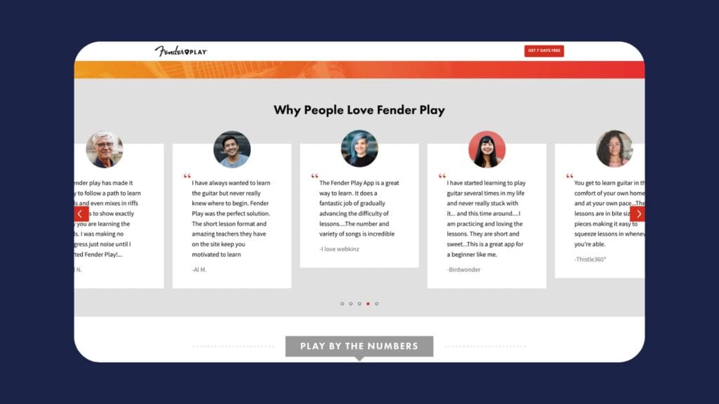
Use Social Proof
Social Proof is the practice of adding testimonials, reviews and other forms of endorsements to your landing page. The purpose of social proof is to provide users with evidence that other people have used and purchased your product or service. This provides them with the reassurance that they are making a wise purchase. It also shows that you are a reputable business.
Here’s a great example from Fender
Express your tone of voice
There are many different ways to express your tone of voice. For example, you could use a sentence structure that is long, descriptive and formal. Or you could be more conversational and use emoticons.
It’s entirely up to you and the business you’re making a high conversion rate optimisation (CRO) landing page for. But, the real trick is to find the balance between conveying your key messages and using a tone of voice that differentiates from your competition. And one last thing, it’s important to use a voice that is consistent throughout your messaging.
Webchat
A web chat is a digital channel that allows you to have a conversation with a live person on your landing page.
They are a fantastic tool for generating leads and building relationships with your target users, showing that there are real people at the core of your business. Plus, if they have any questions, they can get an answer instantly!
It’s said that a chatbot improves 80% customer satisfaction rate, therefore adding huge value to your landing page, undoubtedly creating a higher conversion rate for your landing page.
Keep it clear, simple and straight to the point
Every second counts when it comes to converting a user into a customer.
In fact, 20% of written content is actually read by users.
So, make sure your value proposition is clear in your title – don’t beat around the bush – and use headings that tell a user key information without them having to dig deeper.
Here at Hiyield, we like to use a five-second rule.
If you load up the landing page you’ve created and scroll it in 5 seconds, did you get the key information?
If you didn’t, you need to optimise it.
Here are a few pointers to help you out:
- Use bullet points
- Use headings that tell
- Use something bold to highlight key information


Let’s get started!
Great digital products aren’t just built, they’re co-created. Together, let’s breathe life into your idea, crafting solutions that stand out.
Contact